Some Design ... the Processes
Problem: Manual branding for B2B sales in the US took 3 months+ and the entire IT team. There was no way to distinguish and identify elements that could be branded and changed in the assessment journey independent of the whole. This meant pitches were either generic or required intensive manual input and many conversations to create.
Solution: I had a feeling the solution would ultimately lead to a UI re-factor to enable theme-ing: re-writing all references to colors and fonts as variables, at a minimum. However, in contemplating how to start having design conversations with a global distributed team I knew I had to begin with creating the missing manual: I created a design document to capture the end to end experience of the simulated assessment. I also knew the document would be a reference point for many members of the team so I needed to convey the key theme concepts visually:


By having a visual reference point that was easily shared among the team, the design document immediately solved the problem of requirements, requirements could be iterated on, reviewed and moved into stories by BAs, PMs, dev team and business PO, QA. It removed ambiguity and allowed devs to successfully complete items by anchoring the definition of done. It also allowed the entire team to start visualizing design elements as re-usable components.
Problem: The business had no mobile capabilities and it was starting to reflect badly in their market position. As was the stale, inconsistent look and feel. It lacked polish, consistency and needed an uplift very badly. Pretty quickly, I proposed a mobile first re-design.
Before: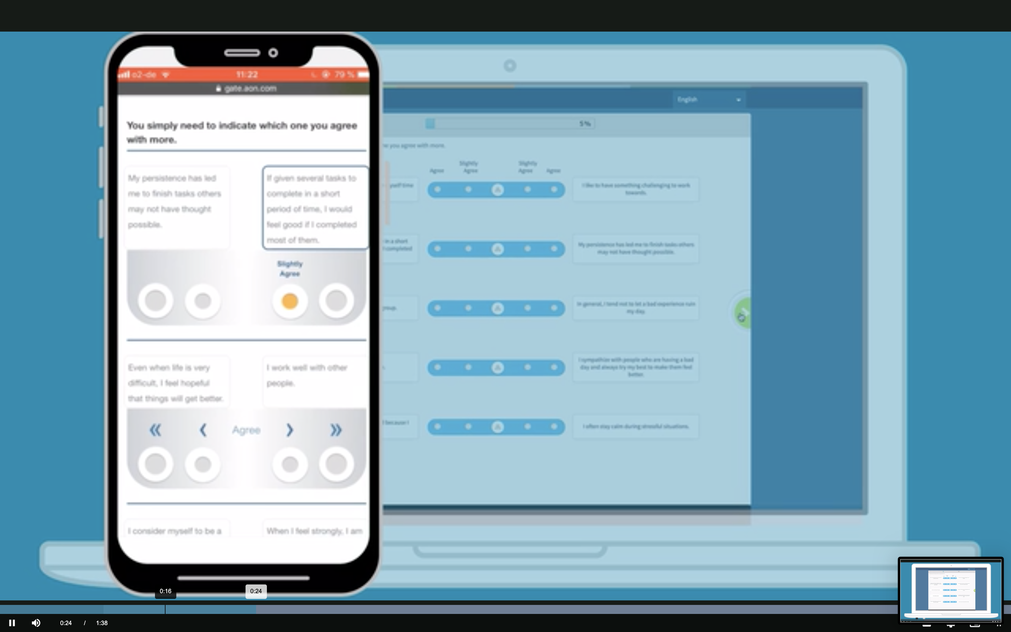
After:
The above was a close-to-final draft. A compromise, as it always is, representing a re-design that was easily referenced by repeat clients who liked the simulations + what I knew to be easily feasibile for the dev team. It calls out themed elements on each slide, represented by red (this was 2016 y'all before xd or figma had design system support). Additionally, a navigation bar was placed at the bottom to enhance the user experience of locating controls on each subsequent screen. But that was not the end of the story . . .
With the visuals in place, a number of awesome things happened. The dev team was able to replicate the design and took about 3 months to build which was easy to justify since each build for each client had previously taken that long. Stories and teamwork was easier to manage with a visual reference point. Then, I started getting asked to use the design document on pitches, it seems it was easier to brand and theme a design deck than commit the dev resources. A pitch was prepared and won for Pepsi based on the above.
But the best part was yet to come for the dev team. By introducing and executing on theme-ing (which I did as well in conjunction with the dev team) we reduced the code bloat of having 50+ uniquely coded simulations for each client to just one + one variables css file. By introducing theme-ing the time to launch or pitch was reduced from over 3 months to a single day (or 3 depending on who and where the push was coming from).
Later iterations included and additional features such as language selection.
Problem: Barclays Brand Guidelines were print only and Barclays Live needed an update.
Solution: I used the existing branding and marketing material to extrapolate a new set of components for web consistent with look and feel (navigation, tabs, links, pagination, buttons and their states). I put them together in high fidelity mock-ups to ensure integrity with the brand.

Beyond furthering the re-brand and it's implementation on Barclays Live, creating the high fidelity mock-ups allowed the team to ideate and many new features and whole pages were conceived including: analyts pages, company pages and editorial style quotes.